Exhibit Highlights
burns library
Seeing Voices: A Brief History of Type
Original Exhibit Fall 2005
Seeing Voices: A Brief History of Type is an exhibit at the John J. Burns Library highlighting the development of typefaces since the invention of printing. Objects on display include medieval manuscripts, incunabula, and books from the Rare Book, Fine Print and Irish Collections.
The exhibit is in three parts. The first, Adapting the Revolution, includes works from the 15th - 19th century, including examples of the work of typographers Aldus Manutius, Claude Garamond, John Baskerville, Giambattista Bodoni and William Morris. The second part of the exhibit, Creating a National Character, exemplifies the development of Irish language typefaces, and demonstrates the effect of political conflict on this process. Books in this section date from the 17th - 20th century. The third part of the exhibit, The Clothes Words Wear, uses items from the Eric Gill, Bruce Rogers, and George Trenholm Collections along with fine print books to display the continuation of typeface design into the early 20th century.
This page features Aldus Manutius' printer's device - an emblem designed by a printer for the easy identification of his product - of an anchor entwined by a dolphin. |
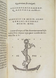 Dictorum et factorum memorabilium libri nouem
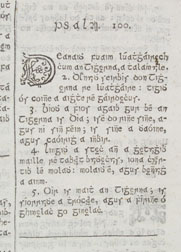
Psalm 100 shown in the typeface known as Moxon, designed by Andrew Sall and manufactured in England by Joseph Moxon. |
 Leabhuir na Seintiomna (The Books of the Old Testament)
A specimen of Frederic W. Goudy's typeface Kennerley Old Style. |
 Frederic W. Goudy, Elements of Lettering
For Further Study: Researchers are invited to view the exhibit and to use related collections. Contact a library staff member for information.
« back